In an online shopping world, the checkout page is the last stop to become a customer. Making it easy and trustworthy can make a big difference in how many people complete their purchases. It’s all about making things simple and earning people’s trust in your store.
Customizing this page is important for a smooth shopping experience. So you need to continue to make your page look better. In this guide, we’ll show you change step-by-step. You can boost your sales. That also keeps customers happy.
What Is The Reason To Edit Checkout In Shopify?
Customizing your Shopify checkout isn’t just about looks. It’s about creating a frictionless journey for your customers. In this guide, we’ll dive into six crucial reasons. That answers why your checkout page is a changer for your online store.
- Keep Your Brand Consistent:
Your checkout page is the final impression customers have of your brand. You need to align its design with your brand identity. You can reinforce brand recognition and trust. That makes the entire shopping experience cohesive and memorable.
- Lower the Rate of Cart Abandonment:
Cart abandonment is a headache for online sellers. A well-tailored checkout page addresses common pain points. There are complicated forms or unexpected costs. That reduces the chances of abandonment and increasing conversions.
By simplifying the process and providing transparent pricing, you reduce friction. This increases the likelihood of customers completing their purchases. Addressing these pain points lowers the rate of cart abandonment. It also creates a more user-friendly checkout experience.
- Boost the Value of Your Average Order:
Design elements and persuasive messaging can prompt customers. That adds more items to their cart. There are showcasing related products. They also offer bundled discounts and a customized checkout page. That can drive up the average order value.
- Increase the Conversion Rate:
The main aim is to change more visitors into customers. You do this by making the checkout process simpler, removing things that distract. That is also making customers feel secure. These actions all help increase how many people buy from you and improve your profits.
- Gain Customer Trust and Security:
In the online world, trust and safety are really important. Customers see secure payment options, trust symbols, and clear rules. They feel more comfortable. This helps keep them coming back to buy from you again and again.
- Enhance Mobile Responsiveness:
More people are shopping on their phones now. Your checkout page needs to work well on mobile. Making it easier to use on smartphones doesn’t just make customers happier. It also helps you sell more and keeps customers satisfied.
How to Edit Checkout Page in Shopify
Customizing your Shopify checkout page is important for making shopping easy. Every little thing makes a big difference. It’s easy to do with Shopify’s simple setup. A better checkout page builds trust, stops people from leaving, and helps you sell more. So, taking the time to improve it is a smart move for your business.
Set a background image for the banner
Changing the background image for your banner can make your online shop stand out. This is especially important because the banner appears at the top of every checkout page. That helps customers remember your store and come back for more. Here’s how you can do it:
Step 1: Go to Checkout Log in to your Shopify admin dashboard, then click on “Settings” and select “Checkout”.
Step 2: Open the theme editor sections In the dashboard, go to “Style” and click on “Customize checkout” to open the theme editor sections.
Step 3: Upload images Look for the “BANNER” section and upload your image by clicking “Select image”. You can choose a new image or one from your library. Remember to choose a pic that is suitable for your brand. If you sell jewelry, a colorful image might be perfect. Besides, resolution for banner images is 1000 x 400 pixels.
Step 4: Click Save After uploading your desired image, click “Save” to confirm the changes. This will set your custom background image for the banner on your checkout pages.
Include a logo on the checkout page
A logo makes your store stand out in the competitive market, especially on Shopify. It is unique and professional.
On the checkout page, Shopify store owners can easily add their logo to the top of the banner. Plus, they can customize their position. That makes it simple to create the perfect look for their store.
Step 1: Go to Checkout Log in to your Shopify dashboard; Click on “Settings” and select “Checkout”.
Step 2: Open the theme editor In the dashboard, go to “Style”; Click on “Customize checkout” to open the theme editor.
Step 3: Upload your logo Find the “LOGO” section; Click “Select image” to upload your logo or choose one from your library.
Step 4: Choose the logo position Decide where you want your logo to appear. It is on the left, right, or center of the banner.
Step 5: Size your logo Adjust the size of your logo to fit nicely on the checkout page.
Step 6: Save your changes You’re happy with the placement and size. Click “Save” to confirm the changes.
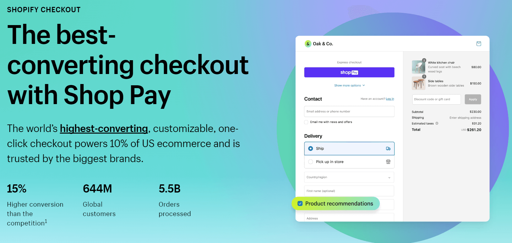
Customize the main content area with a background image or color
You should customize the main content area with a background image or color. Because it is a great way to enhance the checkout pages. This is where your customers enter their shipping and payment information. It’s important to ensure readability while adding visual appeal.
Step 1: Go to Checkout Log in to your Shopify admin dashboard and navigate to “Settings” and then “Checkout”.
Step 2: Open the theme editor sections Click on “Style” and then select “Customize checkout” to open the theme editor.
Step 3: Add the background or image There is the MAIN CONTENT AREA section. You’ll find options to add a background color or image.
For colors: Click on the box next to “Background color”. This is to choose a suitable color or enter a hexadecimal code. For images: Select an image from the library or upload one and resize it. It is for the best appearance.
Step 4: Click Save Once you’re satisfied with your choice, click “Save” to confirm the changes.
Modify the form field colors
You should change the color of the form fields. This makes your online shop stand out and catch the eye of customers, apart from competitors. This also encourages customers to keep coming back.
Do you want to make the fields transparent instead of white? Follow these steps:
Step 1: Go to Checkout Log in to your Shopify admin dashboard; Go to “Settings”; Click on “Checkout”.
Step 2: Open the theme editor Click on “Style” and then select “Customize checkout” to open the theme editor.
Step 3: Select the color of the form fields In the MAIN CONTENT AREA section, find “Form fields” and choose from the list of color options.
Step 4: Click Save Once you’ve selected the color you want, click “Save” to confirm the changes.
Enhance the order summary with a background image or color
You can enhance the order summary with a background image or color. That will greatly improve the appearance of your checkout page. Customers finalize their purchase. They will see a list of the products they’re buying in the order summary. This summary is a look visually appealing and functional. Shop owners can enhance customer satisfaction. Here’s how to do it:
Step 1: Go to Checkout Log in to your Shopify admin dashboard and navigate to “Settings”, then click on “Checkout”.
Step 2: Open the theme editor sections Click on “Style” and then select “Customize checkout” to open the theme editor.
Step 3: Add a background image or color to the order summary In the ORDER SUMMARY section, choose to add a background color or image.
For colors: Click on the box next to “Background color”. This is to choose a suitable color or enter a hexadecimal code. For images: Select an image from the library; Upload one and resize it for the best appearance.
Step 4: Click Save Once you’re satisfied with your choices, click “Save” to confirm the changes.
You can preview your changes using the “Show order summary” feature in the theme editor. This allows you to see how your customized order summary will look before making it live.
Update or remove an image on the checkout page
You can update or remove an image on the checkout page. It is just as easy as adding one. Here’s how you can do it:
Step 1: Go to Checkout Log in to your Shopify admin dashboard and navigate to “Settings”, then click on “Checkout”.
Step 2: Open the theme editor sections Click on “Style” and then select “Customize checkout” to open the theme editor.
Step 3: Replace image Find the image you want to replace. Click on the Update button below it. Then, upload a new image or choose one from your library.
Step 4: Click Save Once you’ve made your changes, click Save to confirm them.
👉 After replacing these images, consider maximizing your SEO by adding alt text to the images. This helps customers find your shop more easily and can boost your sales.
Read more: Discover the 25 Best Shopify Themes for SEO
Alter the font style on the checkout page
You can grab customers’ attention and make your shop more memorable by changing the font style on your checkout page. Shopify offers many fonts to choose from, allowing you to customize your checkout pages easily.
Step 1: Go to Checkout Log in to your Shopify admin dashboard. Click on Settings and select Checkout.
Step 2: Open the theme editor sections Navigate to Style and choose Customize checkout to access the theme editor.
Step 3: Select a font In the Typography section, choose your preferred fonts for headings and body text.
Step 4: Click Save After making your selections, click Save to confirm the changes.
Edit button and accent colors on the checkout page
You can switch up the colors of buttons and accents on your checkout page to make your shop more engaging and stand out in the competitive marketplace.
Step 1: Go to Checkout Log in to your Shopify admin dashboard. Click on Settings, then select Checkout.
Step 2: Open the theme editor sections Navigate to Style and choose Customize checkout to access the theme editor.
Step 3: Change accent colors In the Colors section, you can adjust the colors of accents, buttons, and error messages. Simply click on the color box and select a new color or enter a hex code.
Step 4: Click Save Once you’ve updated the colors, click Save to apply the changes.
Best Practices for Checkout Page Optimization
Display security badges
Displaying security badges involves elements:
- SSL certificates
- Payment badges
- Antivirus software logos
- Money-back guarantees
- Customer reviews
For best results, make sure these badges are clearly shown on your checkout pages. It’s important they’re easy to see and understand. Customers will trust your site and be less likely to abandon their carts. Displaying these security badges is vital because it shows customers your website is safe and dependable. This leads to more sales and long-lasting customer relationships.
Cross-sell and upsell
Cross-selling means suggesting additional items that complement what the customer is already buying. Upselling involves recommending a higher-priced or upgraded version of the product.
During the checkout process, show related or higher-priced items the customer might be interested in. You can display product recommendations or offer upgrades.
Make sure to suggest items that add value to the purchase and enhance the shopping experience. Do not be pushy or overwhelm the customer.
This practice can increase the average order value and revenue. It also provides customers with more options and helps improve satisfaction.
Example: A customer is purchasing a laptop. You could cross-sell a laptop bag or upsell to a model with higher specifications. This not only increases the value of the purchase but also provides the customer with additional accessories or features that enhance their usage experience.
Take advantage of 1-click checkout
1-click checkout simplifies the purchasing process, allowing customers to complete their transactions with just one click. It typically involves securely storing customer information so they don’t have to re-enter it for future purchases.
Implement a 1-click checkout feature on your website or e-commerce platform. This involves securely storing customer information (address and payment details) and providing a button or option for 1-click checkout during the purchasing process.
Ensure that customer data is stored securely and in compliance with data protection regulations (such as GDPR or CCPA). It’s also important to offer an alternative checkout method for customers who may prefer not to use 1-click checkout.
1-click checkout streamlines the purchasing process, reduces friction, and makes it easier to complete transactions. This can lead to higher conversion rates, satisfaction, and retention.
Example: Amazon’s 1-click ordering feature allows customers to complete purchases with just one click, without re-entering shipping or payment information each time. This convenience encourages repeat purchases and helps Amazon maintain high levels of customer satisfaction and loyalty.
Show the checkout flow
Displaying the checkout flow means showing customers the steps they need to take to buy something, like entering their address, choosing how to pay, and checking their order.
Design your checkout page to show each step. Use pictures or lists to guide customers so they see where they are and what comes next. You can also add extra information to explain anything that might be confusing.
Showing the checkout flow makes it easier for customers to complete purchases and reduces the chance they’ll abandon their cart.
Example: Imagine you’re buying a book online. The checkout page might have a progress bar at the top showing steps like “Step 1: Enter Your Address” and “Step 2: Choose Your Payment Method.”
Provide multiple payment and shipping options
Give customers different ways to pay and flexible delivery choices. Payment options can include credit/debit cards, PayPal, or Apple Pay. Shipping choices may range from standard delivery to expedited or same-day shipping.
Consider what your customers prefer and any extra costs, and make those costs clear upfront. This makes shopping easier and more convenient, increasing purchases and overall satisfaction.
Reinforce sales with psychological triggers
Use psychological triggers to influence buying decisions. For example, show limited stock, highlight positive customer reviews, or create a sense of urgency.
Incorporate these tactics into your product descriptions, ads, and checkout process. For example, phrases like “Hurry, only 3 left!” can encourage quicker decisions. Be careful not to mislead customers—make shopping exciting without making it stressful.
These strategies can boost customer excitement, leading to more purchases and a more enjoyable shopping experience.
Example: A gadget store displays “Almost sold out!” next to popular products, showcases happy customer stories, and runs flash sales. This builds excitement and helps customers feel confident in their purchases.
Conclusion
In short, editing your Shopify checkout is the key to more sales and smoother shopping. This guide explained why it matters and walked through steps like adding an engaging background or changing button colors. Keep optimizing your checkout page to simplify purchasing and increase conversions!