How to use analytics dashboard in Mageplaza Size Chart
The Analytics dashboard provides detailed insights into how your size charts are performing and how end-users interact with them — helping you optimize your store’s sizing strategy and improve conversions.
This guide will show you how to use and understand the analytics features.
What is the Analytics Dashboard?
The analytics dashboard displays key metrics and user behaviors related to your size charts, allowing you to track:
- Customer engagement
- Conversion performance
- Returns due to sizing issues
- Time spent on size charts
- Top performing charts
These insights help you measure the impact of your size charts on your store performance and continuously improve the customer shopping experience.
Important Notes
- All data is measured only for published size charts at the time of tracking.
- Empty data: If no data is available for the selected date range, charts/tables will display: “There was no data found for this date range.”
How to Use the Date & Comparison Filter
At the top of the dashboard, you can filter the data to analyze performance over time:
- Last 30 days
- By default, the dashboard shows metrics for the past 30 days.
- Click the button to open the Date Picker and select any custom time range.
- No comparison
- The default view does not compare data over time — metrics are displayed as a single line chart.
- Comparison mode
- Click the Compare to… button to select a time range for comparison.
- The chart will then display two lines:
- Solid line = current period
- Dashed line = comparison period
- Refresh data
- Click the Refresh icon to update the dashboard with the latest data.
- Or, you can also press F5 or reload the app to refresh the data.
- Filter by Chart
- All charts (Default)
- By default, all published charts are selected.
- Filter by specific chart
- Click the dropdown to select a specific published chart.
- The dashboard will update and display metrics for the selected chart only.
- If filtered by All charts:
- The dashboard displays Top performing charts based on Total clicks.
- If filtered by 1 chart:
- The dashboard displays Top products added to cart, based on Total add to cart metric.
- All charts (Default)
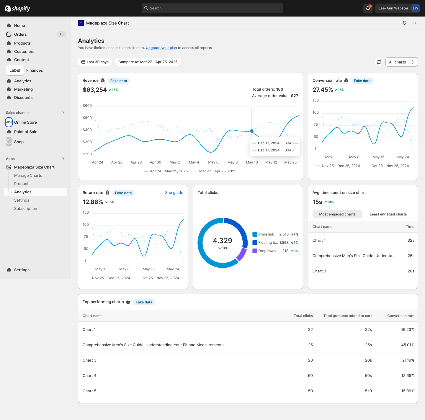
How Metrics Are Calculated
Here’s how each metric in the dashboard is calculated:
1.Revenue
Revenue = Total revenue generated through Mageplaza Size Chart.
Notes:
- Merchants need to grant permission for the app to track orders.
- Only revenue from products that were purchased after customers viewed the Size Chart is counted.
- Returns/refunds are not deducted from this number (wrong-size returns are counted separately in Return rate).
- Revenue currency = Store currency by default.
2.Conversion rate
Conversion rate = [ Total number of products added to cart after viewing size chart / Total number of size chart views ] × 100%
Notes:
- Conversion rate is not session-based.
- Total Size Chart views = Total number of times customers opened a Size Chart.
- Add to cart is only counted if the customer clicks on the Size Chart and then adds the product to cart within the same session. Each event counts as +1 successful Add to Cart.
3.Return rate
Return rate = [ Total returned orders due to wrong size from SC users / Total orders from SC users ] × 100%
Notes:
- Please make sure that the reason includes the word “size”.
- Any return/refund reason that includes “size” (for example: “Wrong size”, “Size too small”, “Size issue”, etc.) will be counted toward the return rate.
Read more: What is return rate and how to set up return reason tracking?
4.Total clicks
Total clicks = Total number of customer clicks to open the size chart on storefront.
- Measurement method:
- This is an event recorded when a customer clicks to open and view the Size Chart details.
5.Average time spent on size chart
Average time spent on size chart = [ SUM(time spent on size chart for each session) / Total number of size chart views ]
Notes:
- Time is recorded from when the Size Chart is opened until the customer closes the Size Chart or leaves the page.
- Unit: minutes, seconds
- The dashboard displays the average time via inline link and floating button only — excludes dropdown data.
- For Avg. time spent on Size Chart:
- The dashboard displays 2 segments:
- Most engaged charts (up to 3 charts with highest avg. time)
- Least engaged charts (up to 3 charts with lowest avg. time)
- If there are fewer than 3 published charts, data will be shown accordingly.
Example:
- 1, 2, or 3 published charts → detailed chart engagement will match the actual number of charts
- 4 published charts → 3 Most engaged charts, 1 Least engaged charts
-
5 published charts → 3 Most engaged charts, 2 Least engaged charts
- If the merchant filters by a specific chart → the dashboard displays Avg. time spent for that single chart only.
6.Top performing charts
Top performing charts: Display the top 5 Size Charts with the highest conversion rate.
That’s it!
Now you know how to use the Analytics Dashboard in Mageplaza Size Chart & Size Guide to monitor and optimize the performance of your size charts.
Tracking these insights helps you:
- Improve the sizing experience
- Reduce returns
- Increase conversion rates
- Make data-driven decisions for your store
Tip: Regularly check your analytics to identify your best-performing size charts and improve those with lower performance.