How to customize the appearance of Size Chart popup
The appearance of your size chart popup depends on the button type you choose: Button, Dropdown, or Both Button & Dropdown. In this guide, we’ll walk through customizing each option so you can match it to your store’s design.
Go to Appearance > Advanced settings > Click Start customizing.
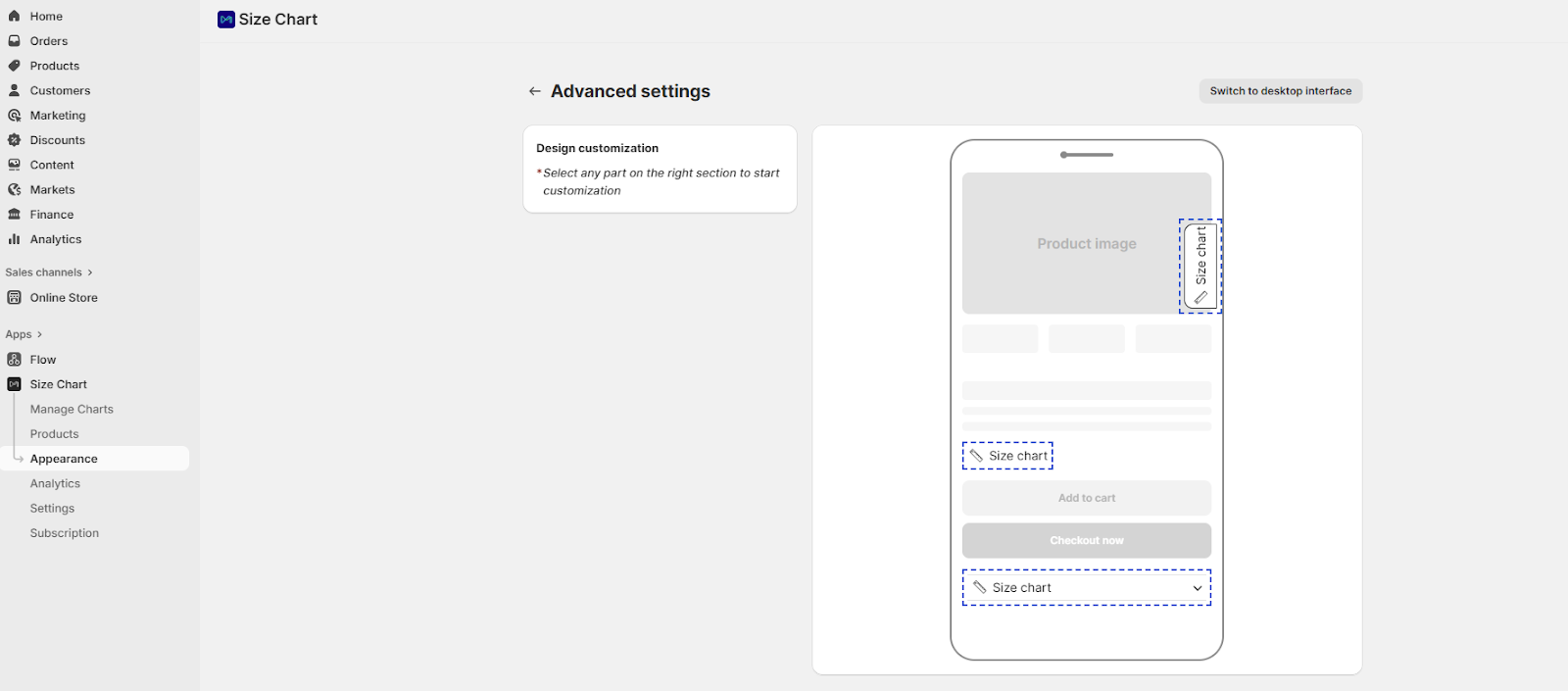
Tip: Select any part of the right-hand preview section to begin customization.
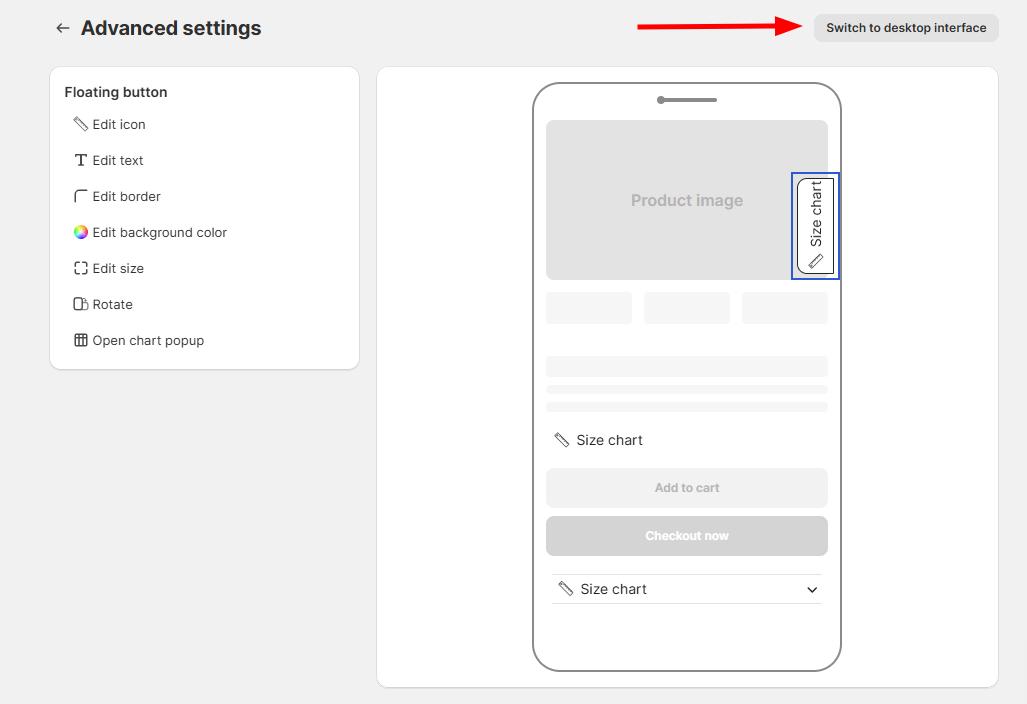
Customize floating button
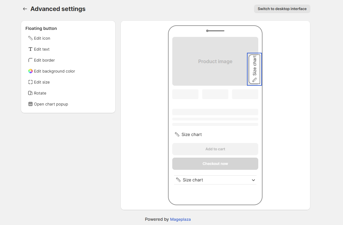
Click on the Floating button in the preview to open customization options:
- Icon: Select from preset icons or upload your own.
- Text: Edit button text, change font color, size, weight, and style.
- Border: Add and customize border color and corner radius.
- Background color: Change the button’s background color.
- Size: Adjust button dimensions.
- Rotation: Rotate the button by 90° for vertical alignment.
Customize inline link
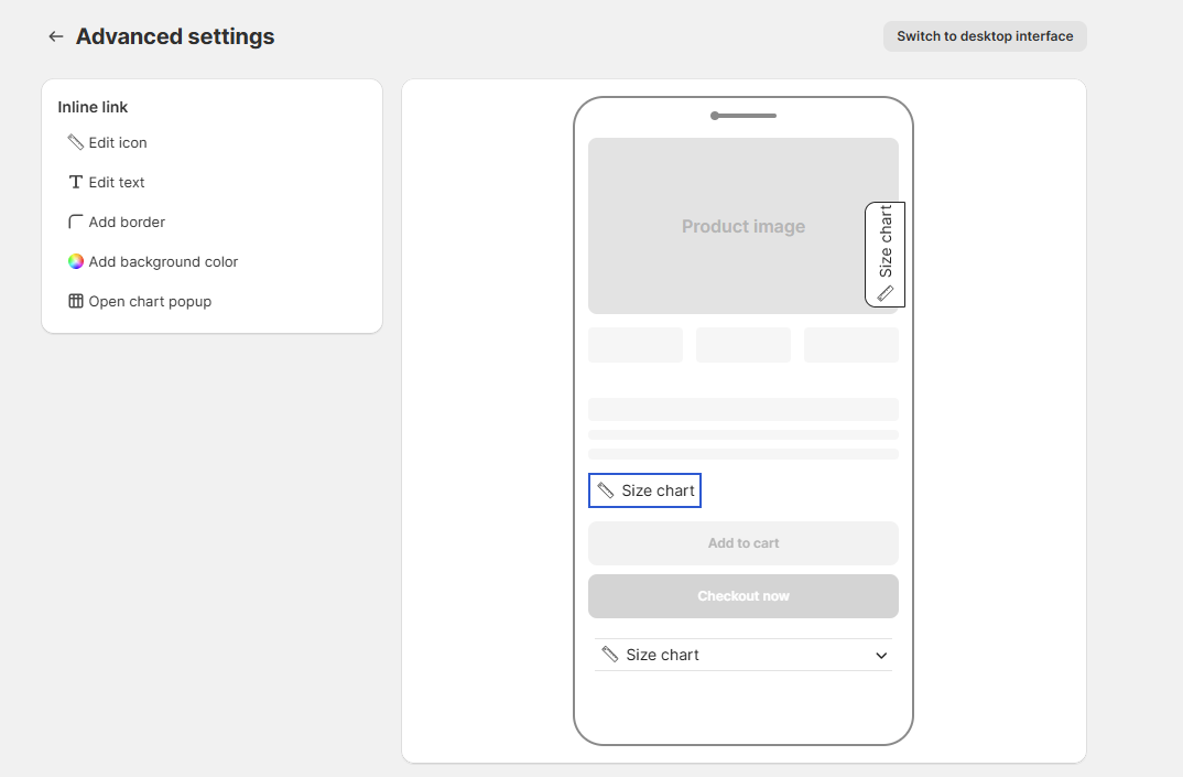
Click on the Inline link in the preview to edit its style:
- Icon: Choose from preset icons or upload custom icons.
- Text: Edit text, font color, size, weight, and decoration.
- Border: Add and style the border.
- Background color: Apply a background color to the link.
Customize dropdown
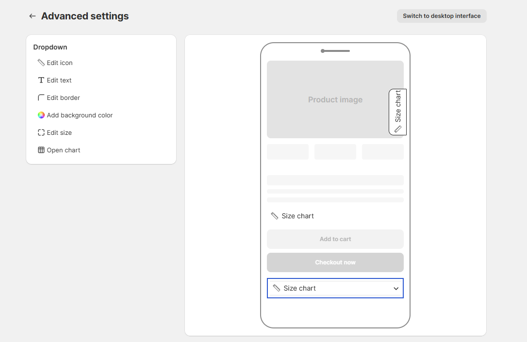
Click on the Dropdown to adjust:
- Icon: Select or upload icons.
- Text: Edit label text, font size, weight, and style.
- Border: Add or change border color and shape.
- Background color: Customize dropdown background.
- Size: Adjust the dimensions.
- Rotation: Rotate if needed.
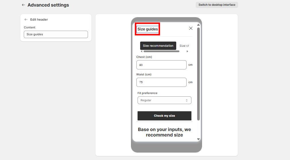
Customize size chart popup
Click on Size chart popup in the preview, then select specific elements to customize:
Size recommendation tab
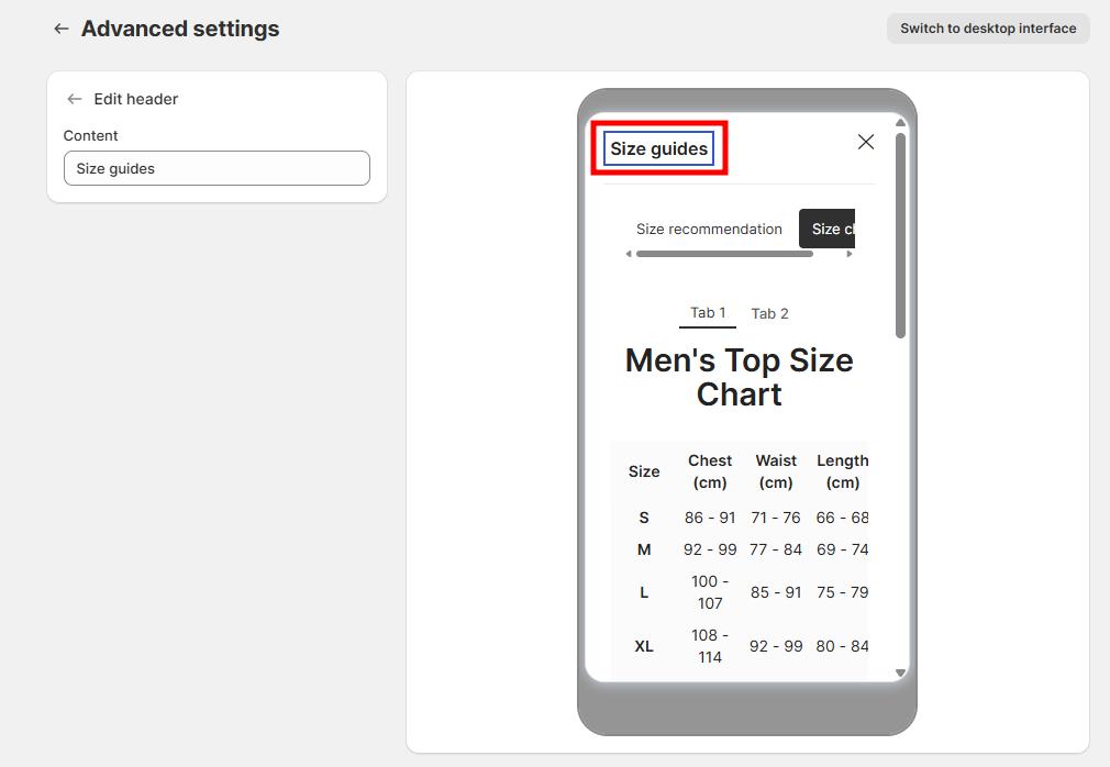
1. Content: Allow editing of the content of the header.
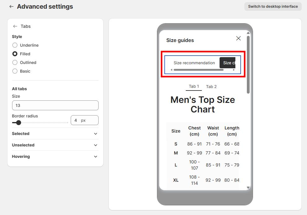
2. Tabs
Allow you to organize content (e.g., Size chart and Size recommendation) within the popup. You can customize their appearance to match your store design.
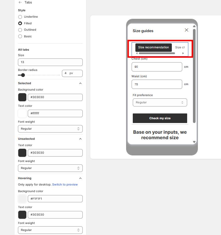
- Style Options: Choose from 4 tab styles:
- Underline: Only an underline highlights the selected tab.
- Filled: The selected tab has a filled background color.
- Outlined: Adds a border around tabs.
- Basic: Minimal style with simple text.
- Size: Adjust tab font size in pixels.
- Border radius: Define the corner roundness of tabs (e.g., 0px = square corners, higher px = rounded edges).
- Selected Tab (active tab customization)
- Background color: Set the fill color.
- Text color: Customize the text color for selected tab.
- Font weight: Choose Light, Regular, Medium, Bold, Semi-bold.
-
Unselected Tabs (inactive tabs)
- Text color: Define text color for unselected tabs.
- Font weight: Choose Light, Regular, Medium, Bold, Semi-bold.
-
Hovering (Desktop only)
- Background color: Set background when hovering.
- Text color: Choose text color on hover.
- Font weight: Choose Light, Regular, Medium, Bold, Semi-bold.
3. Fit preference
- Dropdown style
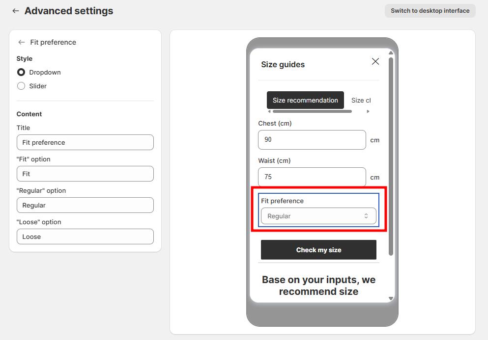
- Content customization
- Title: Edit the title shown above the fit preference field (e.g., “Fit preference”).
- “Fit” option: Define the label for tight or body-fit preference (e.g., “Fit” or “Slim”).
- “Regular” option: Define the label for standard fit preference (e.g., “Regular”).
- “Loose” option: Define the label for relaxed or oversized fit (e.g., “Loose” or “Oversized”).
- Slider style
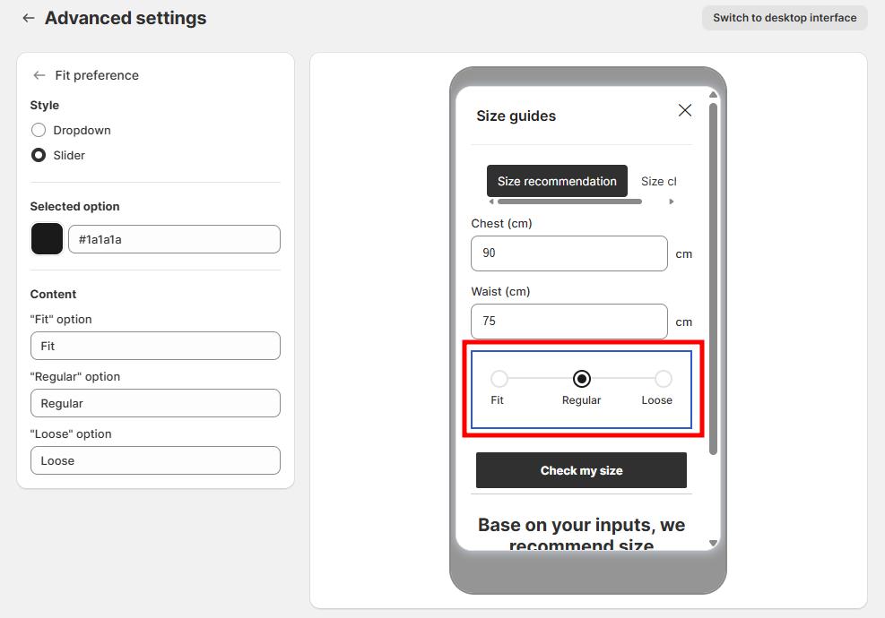
- Selected option: Choose a color for the selected option to highlight the customer’s choice on the slider.
- Content customization:
- “Fit” option: Edit the label for tight or slim fit
- “Regular” option: Edit the label for standard fit
- “Loose” option: Edit the label for relaxed fit
4. Button style
- Filled
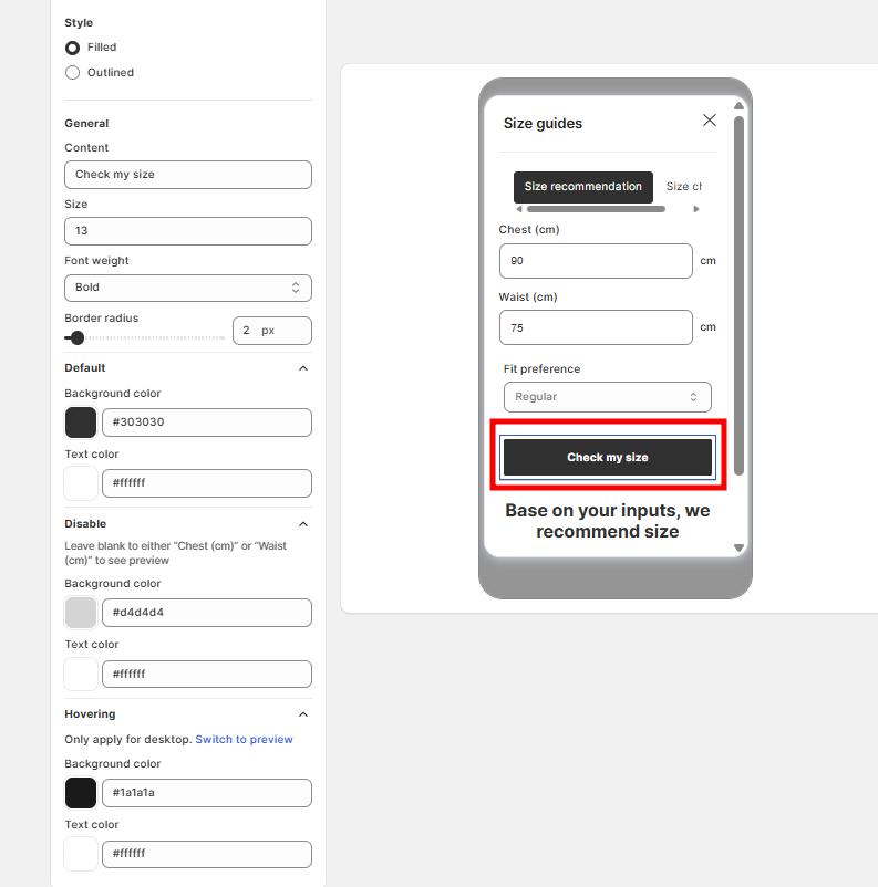
- Outlined
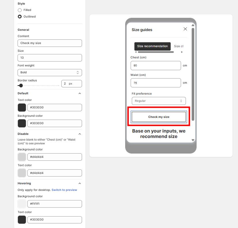
- General settings
- Content: Edit the button text (e.g., Check my size, Find your fit).
- Size: Adjust font size.
- Font weight: Choose from Regular, Bold, etc.
- Border radius: Adjust the roundness of button corners (in px).
- Default state
- Background color: Set the main button color (e.g., black #303030).
- Text color: Set the font color (e.g., white #ffffff).
- Disabled state
When required fields (e.g., Chest or Waist) are empty, the button shows as disabled.
- Background color: Set a lighter shade (e.g., grey #d4d4d4).
- Text color: Customize to match your store.
- Hovering (Desktop only)
- Background color: Set a hover background (e.g., darker or highlighted shade).
- Text color: Adjust for better visibility when hovering.
5. Title
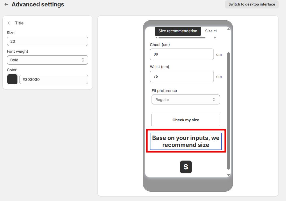
- Size: Set the font size (in px) for the title text.
- Font weight: Choose the thickness of the text (e.g., Light, Regular, Medium, Bold, Semi-bold).
- Color: Pick the text color using HEX codes
6. Suggested size
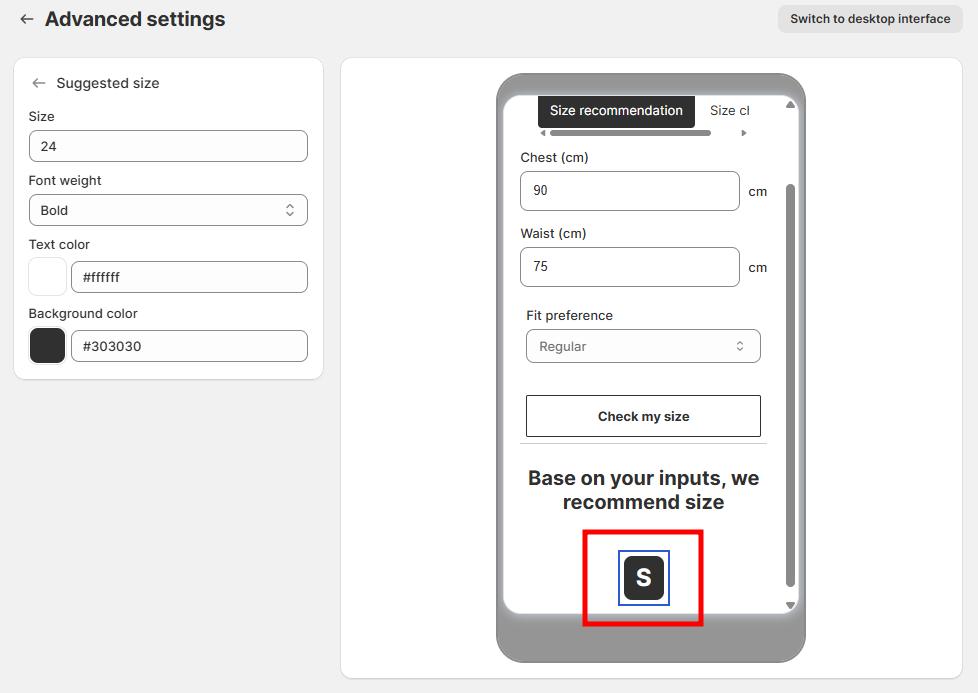
- Size: Adjust the font size of the suggested size text.
- Font weight:
- Choose the thickness of the text (Light, Regular, Medium, Bold, Semi-bold).
- Bold is recommended to highlight the suggested size.
- Text color: Pick a color for the size text.
- Background color: Set the background color behind the suggested size.
Size chart tab
1. Edit header
Allow you to edit the content of the header.
2. Tabs
Customize the same as size recommendation tab.
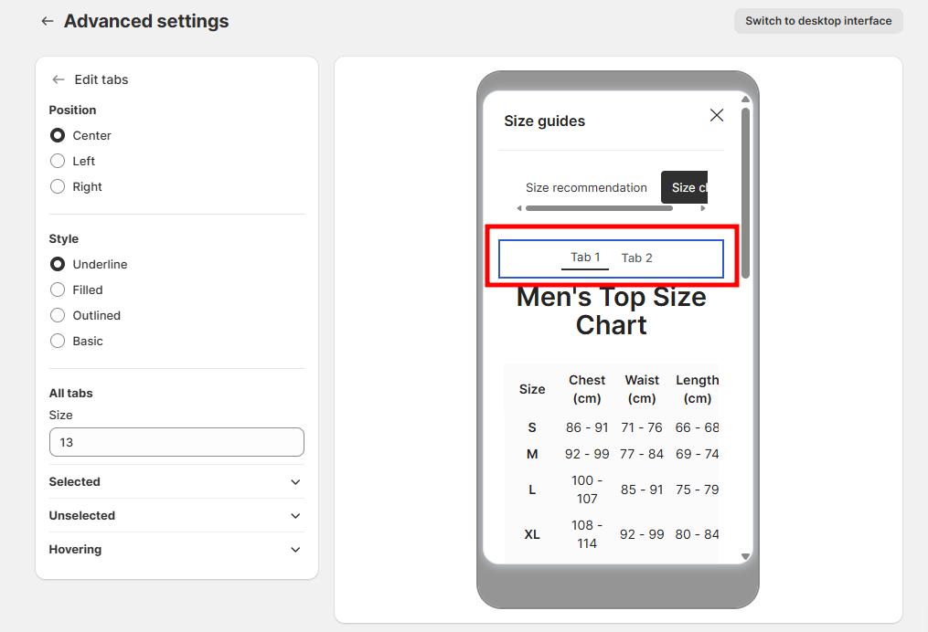
3. Edit tabs
Customize them to be the same as the tabs above.
4. Edit table color
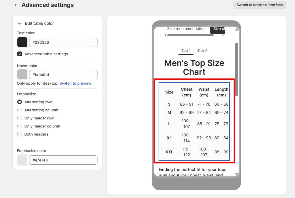
- Text color: Customize the color of text in the table
- Hover color: Set the highlight color when customers hover over rows/columns
- Emphasis: Choose which elements to emphasize (alternating rows/columns, headers)
- Emphasis color: Set the color used for emphasized elements
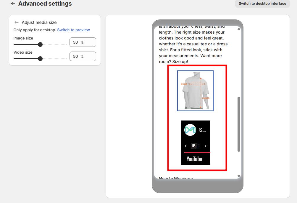
5. Media (Images/Videos)
Adjust media size percentage.
Mobile vs desktop views
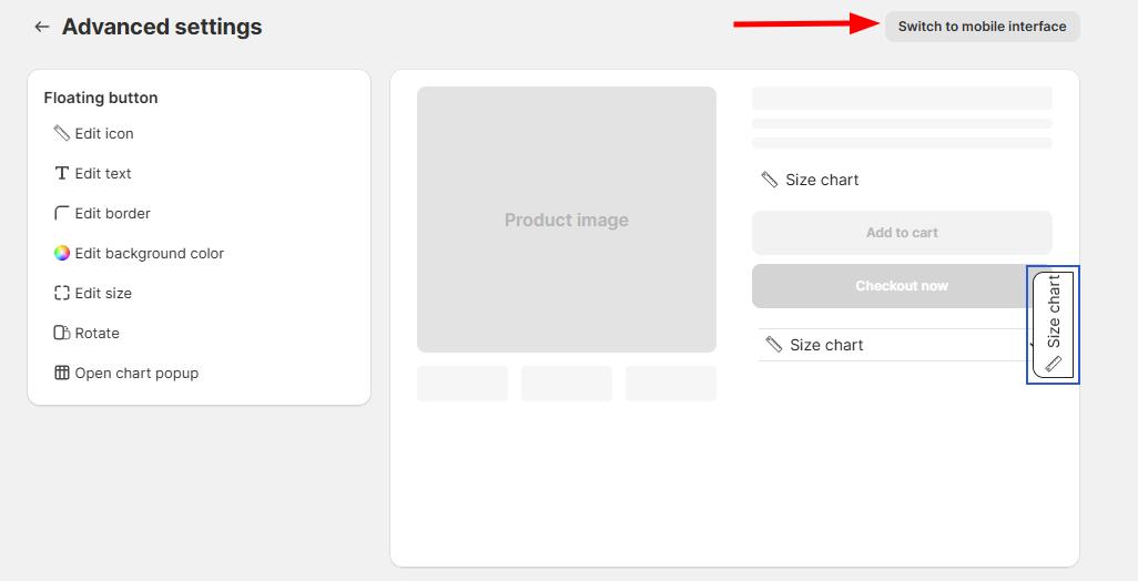
- Use the Switch to desktop interface button to toggle between mobile and desktop views
- Some settings (like alignment and size) only apply to desktop view
- When in mobile view, a helpful message will prompt you to switch to desktop view for these settings
Tips for effective customization
- Match your brand colors: Use your store’s color palette for a consistent look
- Consider contrast: Ensure text is readable against your chosen background colors
- Test on mobile: Your size chart should look good on all devices
- Keep it simple: Don’t overcomplicate the design - focus on readability
- Use emphasis wisely: Highlight the most important information in your tables